
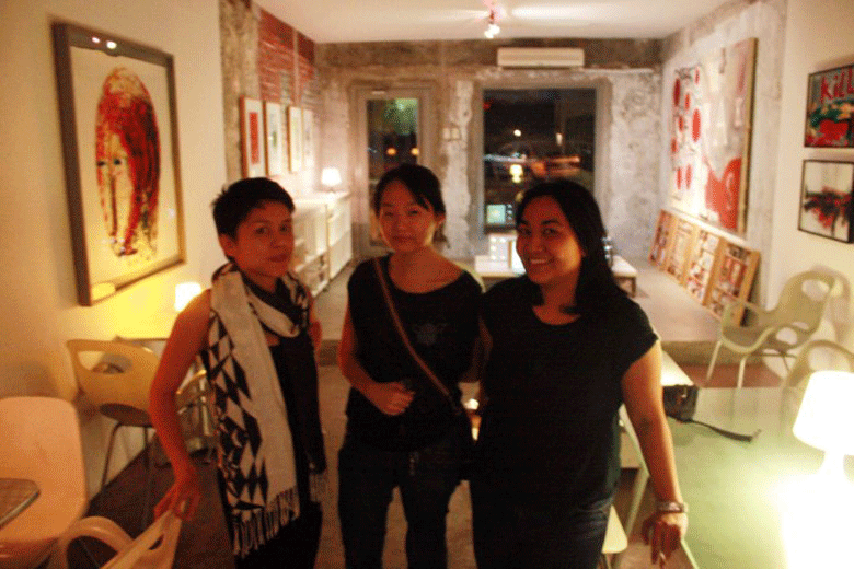
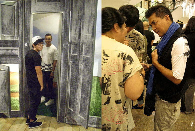
 Post-reopening guests, artists Patricia Eustaquio, MM Yu and Nona Garcia.
Of the local galleries, Green Papaya holds a distinguished spot. It can be outrageously intellectual one moment, say, in exploring the interrelationship between performance and dialogue (“The snobbish tone of a roundtable discussion belies the possibility of taking something much seriously than how it already appears to be because surely there is nothing as tedious than witnessing steadfast attempts of repeating patterns to the point of their own exhaustion.” Whew, ka-exhaust.) Or when talking about the annual Serial Killers group show (“Serial Killers is a response to parallel notions of seriality, non-seriality, or counter-seriality.”). Still, from that high up, nowhere in the art scene is the atmosphere most grounded than at the rough-around-the-edges halls of this space near the corner of T. Gener Street and Kamuning Road in Quezon City.
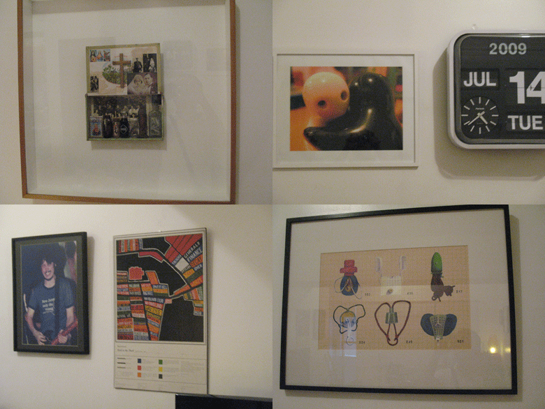
Here, far from the polished, finished walls of the spaces everywhere else, despite the occasional presence of collectors and other demigods, the artist surveys the new works of their colleagues, then parties about unencumbered, owning the space like home. Maybe it’s the artists who run it. Maybe it’s the San Miguel. The thing is, no matter the culprit, Green Papaya is—to use a not-very-cool description—fun. And now that the space is on its third incarnation—as a full-fledged bar but with art on the side—the interiors remain possessed of its original resolve: to carry the best and, ugh, wasak in contemporary art, and to give the community an all-embracing second space to come home to.JG 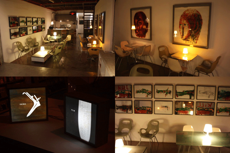 The ground floor space is the bar and art shop (selling small, old works by the likes of Maria Taniguchi and Nona Garcia), the second floor has been turned into a studio and living space for artist and gallery owner Norberto "Peewee" Roldan. Clockwise from top left: the bar had been moved further to the front and serves, the last time we were there, red wine, vodka, Johnnie Walker and beer, of course; works by New York-based artist Gaston Damag unearthed from the Papaya archives; more works by Damag who recently had a show of installations at sLab; and lightboxes by Nona Garcia.
Green Papaya Art Projects is located near the corner of T.Gener Street and Kamuning in Quezon City. It's open from 4pm onwards Wednesdays, Fridays and Saturdays.
Photographs by Rico Quimbo.
Wednesday, March 3, 2010
FRESH PAPAYA ] A favorite space undergoes a little retweaking
Sunday, November 22, 2009
ARTIST IN RESIDENCE ] At home with Diego Castillo, musician
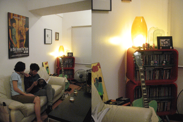
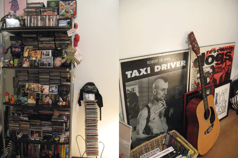
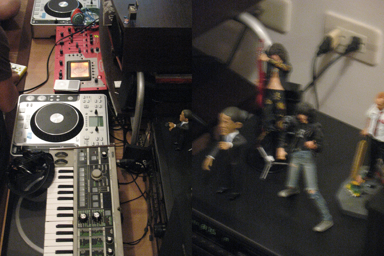
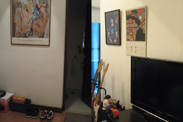
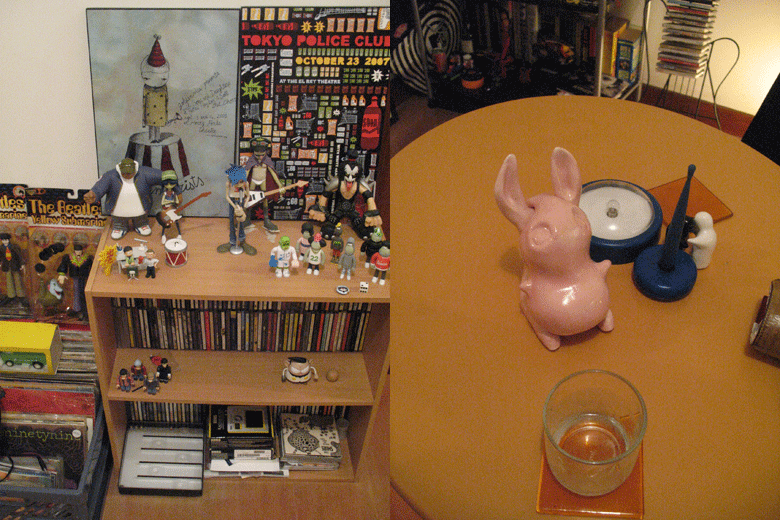
Diego Castillo is guitarist of the band Sandwich. Photographs Jerome Gomez
.
Monday, November 9, 2009
RYAN+GAROVS ] They shoot everywhere, don't they?
 Ryan shoots Ryan.
You and Garovs, are you a couple?
Ryan: Yes! :)
Garovs: Yes, a couple of dorks.
What is everywhereweshoot?
R: It's an online portfolio
G: …that we put up after graduating from college to cut on printing costs when we’d apply for jobs. It used to be filled with projects we did through college and some cheesy portfolio material we’re not too proud of. Haha. Now its filled with published works and because you asked that question, I think its time to change our site’s layout!
How do you divide the work between you two?
R: Garovs as the stylist and creative director who assists me when she doesn’t style or direct.
G: Ryan as the Photographer and web designer who is also my assistant stylist when we’re shooting and when we’re not. Both (of us) Graphic Designer and driver.
How long have you been working together?
R: Since late 2005.
How's it been so far?
R: Lovely! hihihihi
G: Four years went by too fast!
What do you admire most about his work? About hers?
R: Everything.
G: Spontaneity and randomness. When we need to brainstorm for a project, we realized that when we’d meet to list down ideas, we’d end up arguing and wanting to kill each other. So now we’d do errands, walk around malls or parks, visit friends, make chikahan, eat, then somehow, at the same time, we see something that links to the project—KA-BOOM! We get excited and build on it. Concept done. Eerie, no? Or maybe we’re just making up excuses for not wanting to work on a desk at office hours.
 Garovs by Ryan.
What inspires you?
R: Everyday life.
G: Coffee and cigarettes after lunch.
How do you start your day?
R: Checking our email.
G: Go through my bookmarks, while facebooking, ‘til coffee kicks in.
What do you look forward to on an ordinary day?
R: Doing unusual stuff
G: Getting a haircut, going to the park. Also, randomly seeing a friend and making chikahan
What's the best thing about what you do?
R: Being able to do what we love to do everyday and seeing we can do it forever.
G: That we get to meet interesting people in the photo/ fashion/ graphic design/arts/music/film and other industries that we work with.
Describe your work station/desk/studio? Favorite things that it contain.
R: It's a mess.
G: We work outdoors, usually in the car too, we don’t take too long rendering things on the MBP. I think The Fort is our workstation. Highstreet has a steady breeze, grass, chill passersby, and treats! And friends!
Music you agree on most of the time.
R: Old music, indiepop, any song actually
G: Ryan, aminin mo na, we love belting out on 96.3Wrock!
What are you working on at the moment?
R: Secret.
G: Yes, will launch the secret by December. Its not Victoria’s ha! Also, we’re working on sleeping before 3am.
For the works of everywhereweshoot, click here.
Tuesday, October 27, 2009
INTERIOR MOTIVES ] How to mix your Gary Pastrana with your Bo Concept
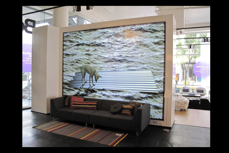 The lightbox on wall is "Frieze," photographic transparency by Poklong Anading, 2009.
It was a how-to party that took a long time coming. "Why only now?" I asked Manuel Chaves last Wednesday at the Interior Motives event at Bo Concept. Contemporary art meets contemporary furniture. It was such a simple idea, and yet, as Manny puts it, "swak na swak." Of course, it also questions the long frowned-upon practice of buying art according to the color of your living room. But I guess, what with some of the artists themselves in attendance, and the smart handiwork of Mawen Ong, the owner of Bo (herself an artist), that question never quite entered the establishment's huge glass doors. Inside, the only thing you could hear is the music by Caliph8 and the guilt-free clinking of champagne glasses. Mawen Ong's "Still Life 2 and 3" and "No Limits in Color," acrylic on canvas by MM Yu.
 Sculptures made of masking tape, by Gary Ross Pastrana.
 "Prayer wall," manipulated images of the Dalai Lama, by Pardo de Leon.
 Kaloy Olavides' collage on canvas, "Les Mannequins 1" by Felix Bacolor, and (right photo) "In Loving Memory of Together and Forever" by Geraldine Javier.
  Doppelganger by Bernardo Pacquing.
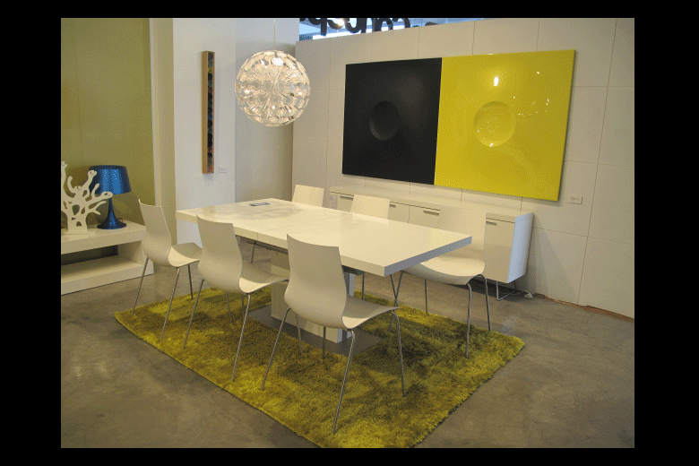 Reg Yuson's "Who's Afraid of Yellow," diptych, automotive paint on fiberglass panels, 2008.
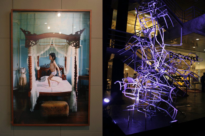 Our favorites: At Maculangan's "Opera 10," and Johnny Alcazaren's "The Odds Are Stacked," discarded chair parts, by the entrance.
All photographs courtesy of Mawen Ong of Bo Concept.
Monday, September 28, 2009
DESIGN OF THE TIMES ] Graphic designers for Project Ondoy

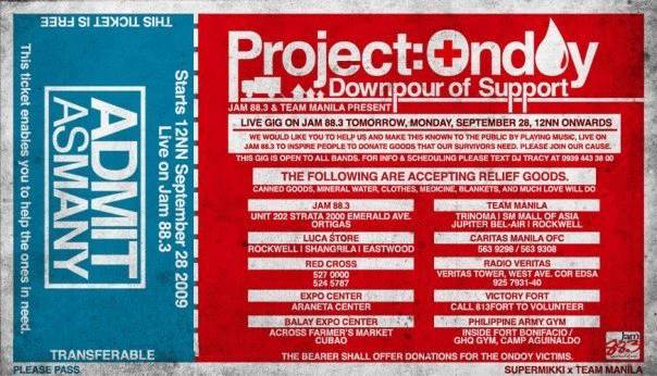
Yesterday, Team Manila's Jowee Alviar sent a shoutout to graphic designers on Facebook to create a poster that will inspire people to do their share in reaching out to the victims of the storm Ondoy. Here, just some of the posters that creatively cried for help. From top left: Ali Molloy, Inidoro Graphic Design Lab, Tof Zapanta, AJ Dimarucot and Karrots Nazareno.

Monday, September 21, 2009
POST 100 ] Starting anew
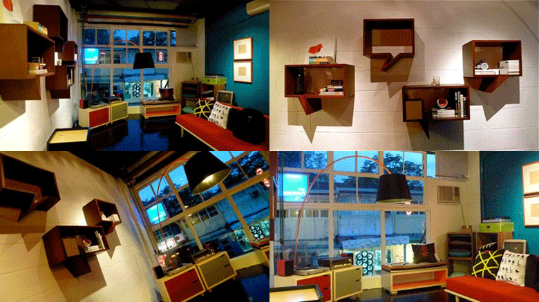
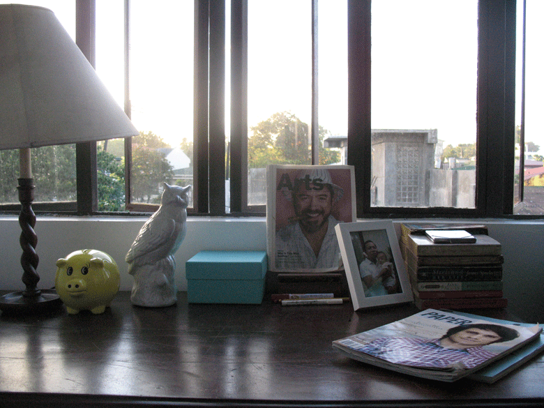 My working desk at home--on a good day.
Written for my last issue at Metro Home & Entertaining.
It took a long time coming but last July, at 35, I finally moved out of my sister’s house into a place of my own. She has just given birth, you see, and suddenly the house has been taken over by cribs and toys and feeding bottles, and this being the first grandchild in the family, my parents have been visiting the house more frequently than usual and sleeping over. Suddenly, there was no place to write and be quiet, and drinking at home just got less fun when sober people are looking. So I moved. A couple of blocks away. Baby steps.
My new space is a one bedroom flat in a lowrise condominium unit in Quezon City. Nothing fancy. Comfortable size. Far from the shoeboxes I found around the area which seemed just enough for one bed and a chair. I planned to have a waking life in my new home, not just sleep and eat Lucky Me Supreme. I planned to cook, have space to do my exercises, walk around, dance. I planned to invite friends over for dinner and drinks. But then you learn that starting a new life can take awhile. Acquiring even the most basic things can cost you, from the fridge to new locks and keys. Introducing another piece of furniture, no matter how small, eats another fraction of your much-valued space. Lessons that only really hit you once you put down work for this magazine and start building a home of your own.
I learned that you can’t just go on ahead and paint your floors in black enamel and not have it look like you spilled grease on it the night before. I learned that it only takes one fag to screw on a lightbulb. And that the one kitchen item you need to introduce to the house first is not salt or uncooked rice—because your parents said it’s for good luck--but a bottle opener. And everytime I walk up the two flights of stairs to my unit, and get a peek of my neighbors’ homes through their windows, I am constantly reminded of the simplest decorating adage: “Edit, edit, edit.” I realize that what’s keeping a lot of ordinary homes from being the nice, relaxing, visually pleasant coccoons they’re supposed to be is their owners’ mindless acquisition of things, things and more things.
'And the one kitchen item you need to introduce to the house first is not salt or uncooked rice—because your parents said it’s for good luck--but a bottle opener.'
Creating a lovely home sometimes doesn’t have anything to do with taste or the number of interior design magazines you’ve read. It’s about listening to ourselves, looking at our space, and deciding what we really need. Most people, me included, do not have money to hire designers and are left on our own to furnish our spaces. I look at my white space now and think I know that I need a few things but they would hardly amount to ten. “Ang kailangan lang naman natin kama at internet,” an artist-friend told me yesterday. He exaggerates, of course, but he has a point. I still need a small round table and maybe four dining chairs. I need a small steel table with racks to put my one-burner stove on. I think I can dispense with having a coffeetable but an accent chair beside my two-seater couch could accomodate another guest.
For the moment, however, those can wait for the next paycheck. For the moment, I’m good with what I have. A beige sofa bought many years back from a second hand store. A 5x4 painting of a doll submerged in a swimming pool by Keiye Miranda Tuason, the color of water matching the kitchen sink tiles across. There is a floor lamp covered in a white paper material, a moving-in (or moving-out?) gift from my sister. An old school sound system under a glass window that frames the sky. Piles of my old Vogues are now a sort of a low holding table for a Venetian mirror from the Kamuning vintage shops. A few pieces of art lean on the wall next to it. All other walls are empty, and I tell myself there’s nothing wrong with an empty white wall (because really there isn’t). In the morning, since I have yet to put on curtains, the light from outside is a good waker-upper. In the evening, in yellow light, even my crudely painted black floor works, and the place looks, dare I say it, hip yet elegant, like a small-time art space.
As I write this, I am also preparing to start anew in my career. This is my last issue at Metro Home and Entertaining. When I started in this magazine, I was coming from the highly stressful world of showbiz reportage, and Metro Home was a magazine that welcomed my resolve to slow down a bit. I learned a lot along the way: from the designers and stylists we worked with, the homeowners whose fabulous homes we featured, and from Carlo, my boss, whose exacting standards and superb taste is something that I believe is unique to this magazine. He is a relatively new homeowner as well. When I started working with him, he has just moved in to a house he built. From the very first dinner we had there in May of 2007 to the last get-together in July, very little in the house, simple and white all over, has changed. Each dinner, it seems, we are greeted only by a new addition, either a coffeetable decor from a friend, a custom-made piece from a furniture shop in Pampanga or Kamias, or a framed work bought from one of those kitschy art stores in Ermita. Each from a special provenance, each precious-looking in its own way. The house hardly ever looks complete, but it never seemed lacking.
Creating a new life is a lot like like creating a new home. Change eventually happens and when it does we wait some more to fit into it, to make it our own. And while we wait, we live and think and discover things we’d like to take in, bring home, little by little. Nothing special was ever made in a rush. Baby steps. Why hurry? Rat races are for the ordinary.
Sunday, September 6, 2009
GREY SKIES, HITCHCOCK BIRDS ] Cecile Van Straten on her new shirt line
 Ino Caluza (inside dressing area) and Michael Salientes (right photo) both wear the white shirt with extended shoulders.
Why Heather Miss Grey?
I wanted to call it Heather Grey, but I googled and there’s a band apparently, so I added “Miss” so that if I google, I know they’re talking about the brand.
What inspired the initial designs?
The designs were inspired by the time I was trying to lose weight and camouflage my problem areas, and also when I’m too lazy to think of what to wear. I was thinking “comfy chic.”
Why the somber colors?
I love somber colors. By experience I knew that grey is a very hard to sell in Manila, but I love it. To me it’s like navy or black, a basic color, but very informal. I love heather grey, black, white.
Who helped you with the illustrations? And will there be menswear?
I gave Cristine Villamiel a direction and she came up wit the very Hitchcock prints.
Menswear yes. I have to develop more cause Michael (Salientes) gets mad kung walang choice!
Heather Miss Grey is available at Bleach Catastrophe, Greenbelt 5 and Trinoma. Left photo from here; right from Chuvaness.com.
Tuesday, August 25, 2009
EL DICK-OR ] Dahil ang tunay na lalake marunong mag-interior
Most people who frequent Cubao X has at one point or another fancied living on those dark second floor spaces. Well, someone has actually created a home in one of them except we can't live there. No matter how cool it looks. It's actually My Apartment, the men's section of Heima, the rather pop and girly burst of Elle Decor prettiness downstairs selling furniture and stuff. My Apartment opened two Saturdays ago. They can also call it Hei-men. But that might cause a bit of confusion.
DECORATING CLICHE #12* ] Mixing your chairs
Mixing your chairs, like mixing your drinks, can be fun for awhile. But it comes to a point where it's really just a tad foolish. And amateurish.
Choose a style you like and stick with it. This is always more modern.
Having a variety of chair designs for one table is so Rachel Ashwell, and we all know what happened to her. Okay, we don't know what happened to her. Get the point? Even Juday tried this mixing chairs gimmick once (for her restaurant Kaffe Carabana) and even she gave up on that.
*Decorating cliches 1-11.
Monday, August 24, 2009
OUT OF AFRICA ] Designer Vito Selma writes from Johannesburg
I don’t have a permanent spot in the office since I’m busy assisting George de Haast in all the site installations and client meetings. I work from every table and draw from the drafting corner that you saw in the photos. Everyday is a different day. There are days where we just stay in and I’m free to do anything i want (sleep and cook). Other days we work from 8am to 6pm. I also help at the furniture shop of George de Haast. I document the showroom and the new items coming in. While interning, I’m here also to take more photography lessons and other workshops. I’m planning on coming back next year for a longer time to continue my studies.
I love working here! For the past two years, the designs that I produced were from sketches and ideas from my last trip here three years ago. There’s something in the air and my surroundings that really inspire me. I love the balance of city and nature in Johannesburg. The city developed without too much altering in its natural surroundings. So when you drive by the city, you don’t feel like you are in Africa’s boom city. What’s different between working here and in my space in Cebu is that here I’m not working inside four walls. I feel like I’m working outdoors, which I love because I find most of my inspiration from nature. Everywhere I go and everything I see here inspires me, from the Mandela bridge to the redness of the African soil.
I am interning for George de Haast. He has been a designer since 1970 and was the pioneer creative partner of the iconic PLUS ONE stores. He spent years in the Middle East and Europe gaining an amazing list of clients from Nelson Mandela, Boris Becker, Sol Kerzner (owner of the chain of hotels that include Sun City), political families form all over the world, royal families in the Middle East. He has had projects from the South of Spain to the rest houses of the Saudi Arabian royals to vineyards in Cape Town. We (my family’s furniture company in Cebu) have been supplying George de Haast for 20 years now with furniture and accesories, and because of this, we can proudly say our furniture is in some of the most important homes in the world.
Under George de Haast, I try to learn everything I can. He has taught me everything i know about aesthetics. He brings me too meet the clients, the upholsterer, the contractors, in hopes that I learn something new and important from everyone. This is the kind of knowledge I prefer gaining and learning instead of books from school. I am a culmination of everyone I have met in my life so this way of learning is really the best for me. I have known George most of my life, he is family to us. My mom calls him "soulmate.”
This is my third trip to South Africa, a place I fondly call my second home. There is nowhere else in the world I feel just as much as home as I do in Cebu. Every trip here, I mature and learn more. I cannot explain what Africa does to you, it’s simply an experience that I wish everyone gets to try once in their life. They say, "You have to live in New York once in your life." I say Africa!
I think when you're in a different country, it definitely opens up one’s creative mind. You are more aware of things in a bigger perspective. When I’m in the Cebu, I always have to think "outside the box" but when im here I just have to soak everything in. I let ideas and inspirations freely flow into me and out through sketches. When I’m in a different country, it excites me. It excites my mind and my fingers. I wanna see everything and touch everything, everything seems to be almost "out of this world." That’s why I like taking photographs, I get to document everything I come by in life.
I love everything here. The people are warm and I guess I’ve never been to any other country where people are this polite. Another thing I love is the culture and how much of that culture people still carry around. They still proudly wear their clothes (costumes to us) on Sundays to church, they are proud of what they are and where they are from. When im not working, I go to the local markets, I go to the slums, I go to orphanages, I walk around the city, go to museums, basically meet people. I’m trying to soak in everything I can about the people and their culture.
Vito Selma is a young designer from Cebu training in Africa. In Manila, his pieces are sold at Ito Kish in LRI Plaza in Reposo Street, Makati City.
Sunday, April 26, 2009
YELLOW WRISTBANDS, ORANGE CHUCKS ] Butch Garcia on creating the Bagets world
 Collage by JR Agra
I have done other films with Maryo J. De los Reyes before Bagets. I was kind of part of his team. We worked on the concept of Bagets together with the writer Jake Tordesillas and the producer William Leary. We never knew of course that what we were working on was going to be phenomenal. All we wanted to do was to make a really good youth film.
The look of Bagets was not influenced by any local or foreign film before it, nor was it influenced by what was going on in the fashion scene here or abroad. I was inspired by a Beatles poster done by the famous graphic artist Peter Max. He was very popular in the ‘60s, and I wanted that type of coloring. I wanted lots and lots of colors, different color pants for a different color shirt layered on another colored shirt. The kids will love it, I thought. 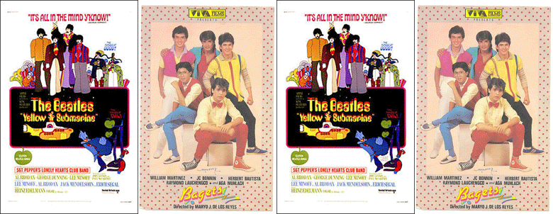
Apart from the Beatles poster, I spent time walking around the university belt, downtown Manila, and watched the kids, what they were wearing, what they were doing with their clothes. I took note of the little nuances: the open shirts, the sneakers, the way they tied their scarves. I adapted all of these but rehashed them by splashing it with lots of color. It was the early ‘80s, and people seemed to have tired from the color explosion of the past decade. So when I was looking around the department stores, from SM and Plaza Fair, all they had were beige and brown. Beige and brown! And the rest was just drab maroon.
So together with my brothers who were part of my production team, we bought a lot of shirts and dyed them. We bought those roundneck Crispa shirts—they were the ones that were really nice--bought our own stencils and printed away. We put pockets where there were none. We spray-painted fabrics. We made our own trinkets and accessories, put safety pins together, etc. We had a budget of P150,000 for the production design and costume. That was a lot of money during that time but clearly not enough for what I wanted to do. I wanted almost every scene to be big. Maglilipat lang ng bahay si Liza Lorena, people had to be playing with fireworks in the background. Mag-eexcursion lang sa beach kailangan may jeep driving through the shore.
The money was certainly not enough to dress up five boys, their girlfriends, their classmates and their mothers. We couldn’t just have people wear their own clothes because the look we were going for, in the clothes and in the sets, were mostly non-existent during that time. We were creating our own world, and we were dressing up its characters the way no one else was dressing up in real life. We had to resort to rehashing old clothes, or going to the department stores. We wanted the look to be different but not alienating to the young audience. I told Maryo that the look has to be reachable and affordable so that the kids will accept it.
Our guinea pigs, of course, were the five boys. They all somehow had similar outfits but you could see that some were a little bit nerdier than the others. At the start of the filming, I had already warned them: ‘Boys, paglalaruan ko kayo, paglalaruan natin ang mga damit niyo.’ Can you imagine any other young gym buff then wearing what JC was wearing: all those colorful shorts and yellow wristbands made of terry cloth? Making Aga Muhlach wear orange shoes was a big fight. And then there was that bowtie in the dance sequence. After awhile, they had began to accept that idea that we were doing something new. They would volunteer their own clothes but we would still rehash them, make them wear a different color undershirt, and then roll the sleeves with the undershirt peeking. That was a signature Bagets look.
They were wearing all these colourful outfits in a very colourful world. Because that was how I thought the kids saw their world, parang ‘70s, like some wonderful acid trip.
Bagets is really my claim to fame. Nobody here can claim that they made a film that changed the way people dressed up. I was nominated in the award-giving bodies the following year, but I never won. I don't even remember anymore who won, or for which movie. But, apparently, everybody seems to remember Bagets.As told to Jerome Gomez
Butch Garcia is the production designer for Bagets. His last film was the underrated Star Cinema project First Day High which tried to recreate a colorful youth world in the mold of Bagets.
...Read more
Monday, April 20, 2009
FONT D'ESPRIT ] Meet the letterheads
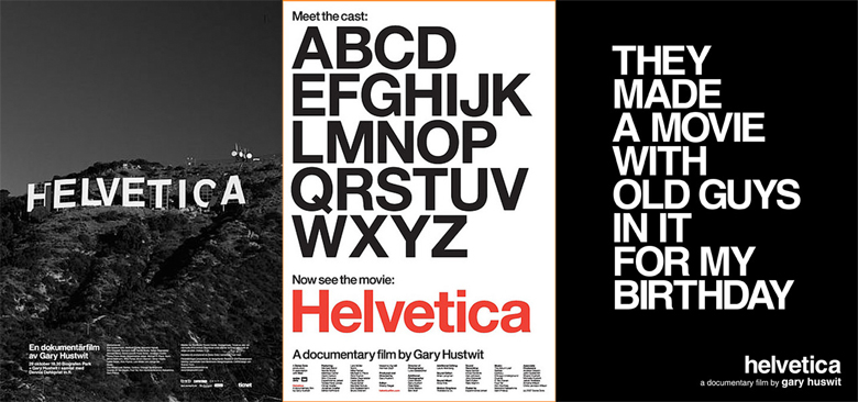
I woke up to this news on the Yahoo! homepage: "Petition to ban most hated font." Or something to that effect. The font in question is Comic Sans which, while I have no emotional attachments to fonts, once made me want to bang my head on the wall when one of my staff, possibly fifteen years older than me in the writing profession, submitted her article using said font. This morning's article is, like the Comic Sans, is a little silly, but a fun read. First, because they used the more pleasing Arial to tell the story. Second, I like this joke: "Comic Sans walks into a bar, bartender says, 'We don't serve your type.'" Like I said, I have no emotional attachment to font types unlike, I guess, Neil, who has been itching to replace the Swank masthead since Day 1 (he finally did) because it looked a little too close to a local men's title. His dream job is to sit somewhere the whole day and design typography, like the old geezers that make up the cast of Helvetica which we saw several months back, and which will be shown tonight, April 21, 8pm at Mogwai Cinematheque in Cubao Expo.
The documentary was released in 2007 in time for the font's 50th anniversary. It's a hip, lovely, inspiring film filled with men obsessed with little things and the spaces that hold, no, embrace these little things. "Helvetica has almost like a perfect balance of push and pull in its letters," Leslie Savan says in the film. "And that perfect balance sort of is saying to us--well it's not sort of, it is saying to us: 'Don't worry, any of the problems that you're having, or the problems in the world, or problems getting through the subway, or finding a bathroom... all those problems aren't going to spill over. They'll be contained. And in fact, maybe they don't exist." And still, the absolutely adorable Massimo Vignelli has a suggestion: "You can say, 'I love you,' in Helvetica. And you can say it with Helvetica Extra Light if you want to be really fancy. Or you can say it with the Extra Bold if it's really intensive and passionate, you know, and it might work." Because imagine saying it with Comic Sans.
